
最近在掘金看到一个有趣的 404 页面挺有意思的,可以点击这个链接看看效果,接下来记录一下完成过程。
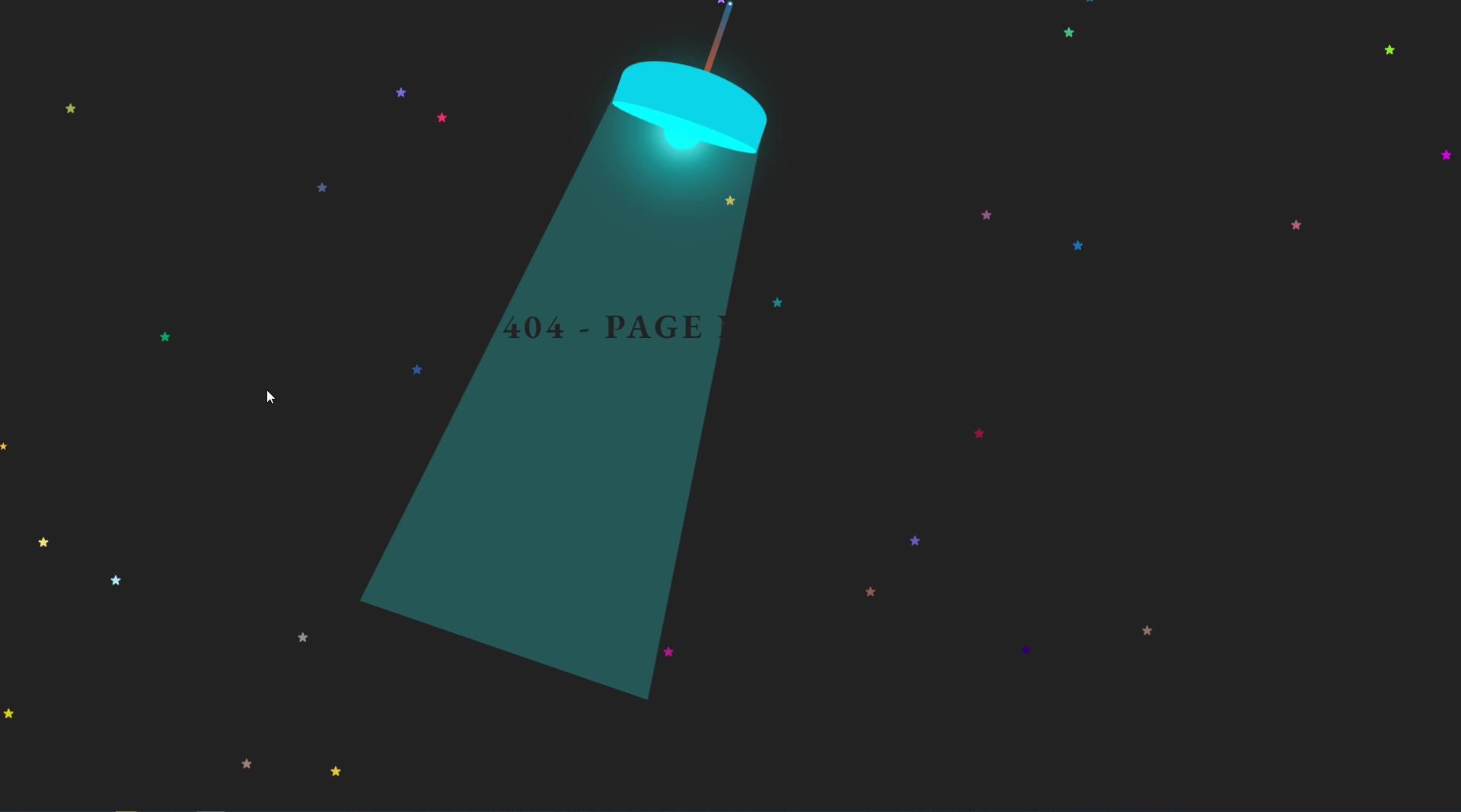
首先分析页面结构,黑色背景上飘过一排星星,上方中部一个晃动的灯,下方两行文字只有灯光扫过,或者鼠标覆盖时才能看到。
下面复盘一下完成过程:
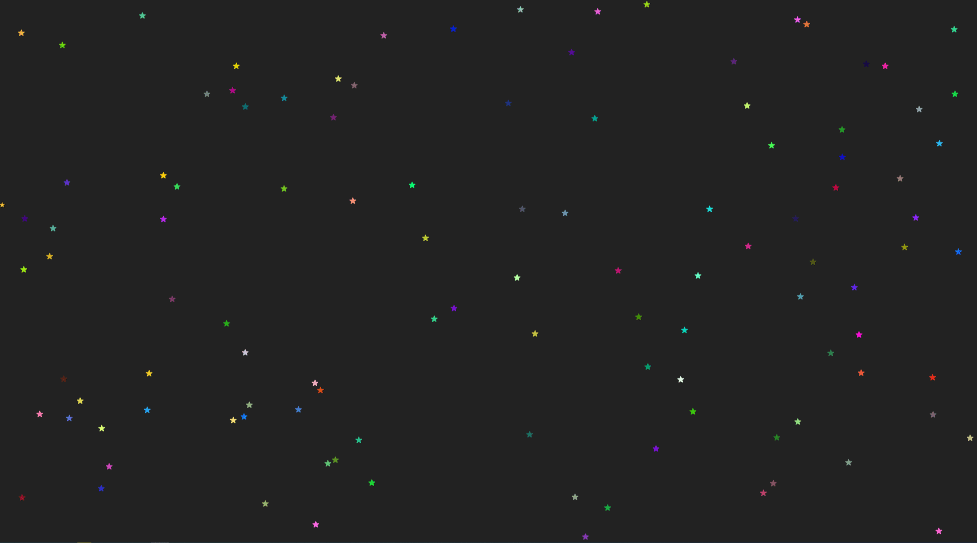
首先是页面背景:黑色背景上漂浮着一堆星星, 星星的位置随机出现,然后向上漂浮。背景没什么好说的,设置全屏宽高后,给个背景色就好了。
大量的星星颜色随机,位置随机,所以不可能自己手敲。我们很容易想到通过 CSS 的多重投影配合自定义属性,随机生成以上背景。
为了背景上的星星效果不显得那么突兀,需要使得点开网页时整屏就有星星,且星星持续从下至上运动,所以盒子下方还会有轮换交替的一屏幕大小的星星,所以我们总共需要生成 3 个星星。第一个星星盒子播放一次动画后停留在最后一帧(即全部消失)。后两组星星盒子重新生成星星后,交替无限播放星星从下向上得运动。
html
<!--- html -->
<div class="bg">
  <div class="star star1">⭐</div>
  <div class="star star2">⭐</div>
  <div class="star star3">⭐</div>
  <div></div>
</div>
css
.bg {
  width: 100vw;
  height: 100vh;
  background-color: #222;
  position: relative;
  overflow: hidden;
}

/* 星星的运动动画 */
@keyframes animStar {
  0% {
    transform: translateY(0px);
  }

  100% {
    transform: translateY(-100vh);
  }
}

@keyframes animStar1 {
  0% {
    transform: translateY(0px);
  }

  100% {
    transform: translateY(-200vh);
  }
}

.star {
  width: 3px;
  height: 3px;
  position: absolute;
  font-size: 0.75rem;
}

/* var(--xxx)是css自定义属性 */
.star1 {
  left: -9px;
  top: -9px;
  text-shadow: var(--randomStar1);
  animation: animStar 10s linear forwards;
}

.star2 {
  left: -9px;
  bottom: -9px;
  text-shadow: var(--randomStar2);
  animation: animStar1 20s linear infinite;
}

.star3 {
  left: -9px;
  bottom: -9px;
  text-shadow: var(--randomStar3);
  animation: animStar1 20s 10s linear infinite;
}
javascript
// javascript
// 利用闭包生成星星的随机颜色
const getRandomColor = function () {
  return (
    '#' +
    (function addCharacters(color) {
      return (color += '0123456789abcdef'[Math.floor(Math.random() * 16)]) &&
        color.length == 6
        ? color
        : addCharacters(color)
    })('')
  )
}

// 生成星星的随机位置
const getRandomPosition = function () {
  const posX = Math.random() * 100
  const posY = Math.random() * 100
  return posX + 'vw ' + posY + 'vh'
}

// 利用多重投影,将星星随机铺满屏幕
const getRandomStar = function () {
  let randomStar = ''
  for (let i = 0; i < 100; i++) {
    randomStar += getRandomPosition() + ' ' + getRandomColor() + ','
  }
  randomStar = randomStar.replace(/,([^,]*)$/, '' + '$1')
  return randomStar
}

// javascript修改阴影属性
;(function () {
  document.documentElement.style.setProperty('--randomStar1', getRandomStar())
  document.documentElement.style.setProperty('--randomStar2', getRandomStar())
  document.documentElement.style.setProperty('--randomStar3', getRandomStar())
})()

// 每次播放动画完成后,重新生成星星位置
setInterval(function () {
  document.documentElement.style.setProperty('--randomStar2', getRandomStar())
}, 20000)

// 在上述规则,添加延时半次播放规则
let i = 1
setInterval(function () {
  i++
  if (i == 2) {
    document.documentElement.style.setProperty('--randomStar3', getRandomStar())
    i = 0
  }
}, 10000)
接着就是灯的效果,基本可以分为灯杆、灯罩、灯泡、追光四部分。
灯杆绕着屏幕上方中心旋转,为了模拟灯杆发热效果,还增加了一个由冷色到暖色渐变的效果。
html
<!--- html -->
<div class="line">
  <div class="pointer"></div>
</div>
css
@keyframes move {
  0% {
    transform: rotate(20deg);
  }

  100% {
    transform: rotate(-20deg);
  }
}

.line {
  position: relative;
  width: 8px;
  height: 100px;
  background-image: linear-gradient(#2094da, #c14119);
  border-radius: 4px;
  margin: 2px auto;
  transform-origin: center 4px;
  animation: move 2.5s cubic-bezier(0.7, 0, 0.3, 1) infinite alternate;
}

.pointer {
  position: absolute;
  width: 4px;
  height: 4px;
  border-radius: 50%;
  background-color: #eee;
  top: 2px;
  left: 2px;
}
然后是灯罩, 根据灯杆绝对定位即可。
html
<div class="cover"></div>
css
.cover {
  position: absolute;
  width: 200px;
  height: 80px;
  background: #0bd5e8;
  border-top-left-radius: 50%;
  border-top-right-radius: 50%;
  top: 98px;
  left: -100px;
}
灯罩里加上一个灯泡,且灯泡周围以及灯罩内部需要有一个高亮效果。
html
<div class="in-cover">
  <div class="bulb"></div>
</div>
css
.in-cover {
  position: absolute;
  width: 200px;
  height: 20px;
  border-radius: 100%;
  background: #08ffff;
  bottom: -9px;
}

.bulb {
  position: absolute;
  z-index: -1;
  width: 50px;
  height: 50px;
  background-color: #08fffa;
  border-radius: 50%;
  left: 75px;
  bottom: -20px;
  margin: 0px auto;
  box-shadow:
    0 0 25px 7px #7fffff,
    0 0 64px 47px #00ffff80,
    0px 0 30px 15px #00ffff33;
}
最后利用边框的分割效果做出一个梯形的散射追光效果。
html
<div class="light"></div>
css
.light {
  position: absolute;
  width: 200px;
  left: -175px;
  top: 20px;
  border-bottom: 70vh solid #2cffff3d;
  border-left: 100px solid transparent;
  border-right: 100px solid transparent;
}
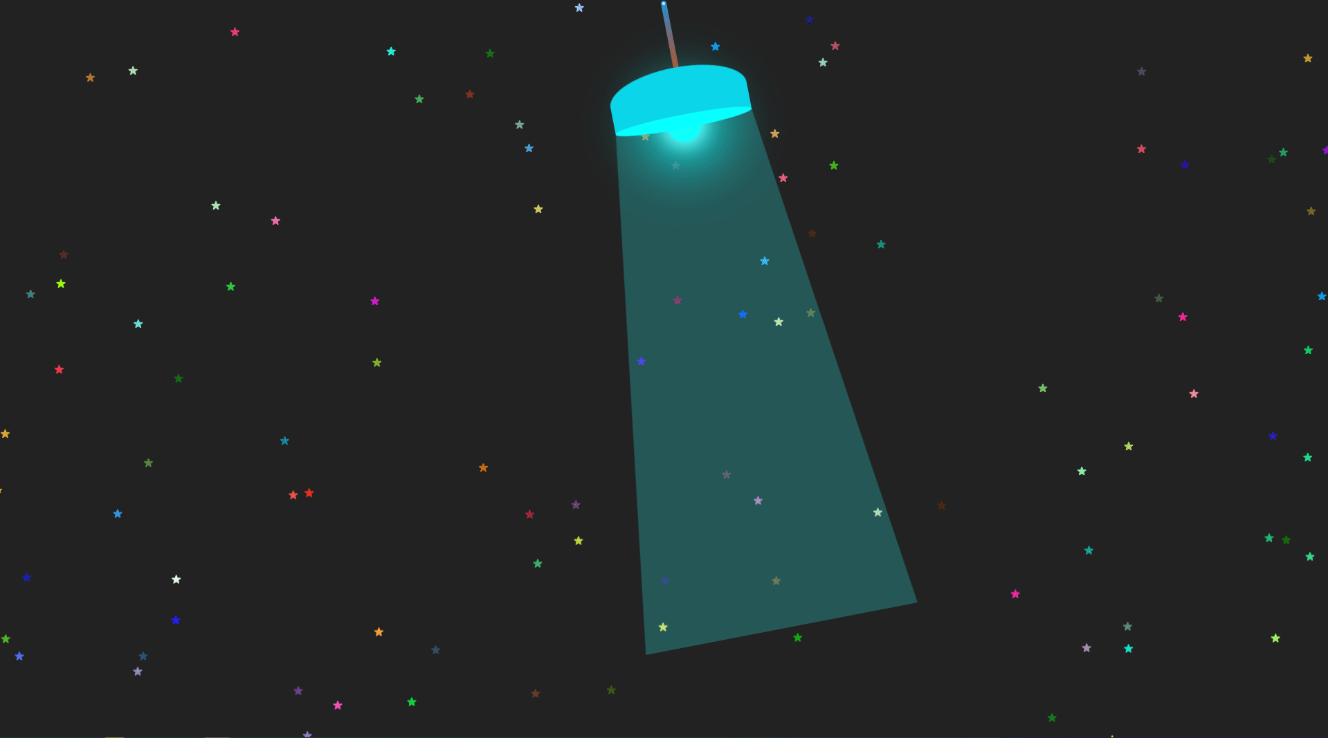
文字颜色跟背景颜色一样,即可将文字隐藏起来。当追光扫过时,就能显示出文字,就不多做赘述了。以上,一个有趣的404 页面就全部完成了。